Text
Wrapper around Text of react-native.

import { Text } from "react-native-magnus";

<Text>Expecto Patronum</Text>;
Example #1
import * as React from "react";
import { SafeAreaView, FlatList } from "react-native";
import { ThemeProvider, Text, Div, Image, Icon } from "./magnus";
const App = () => {
const features = [
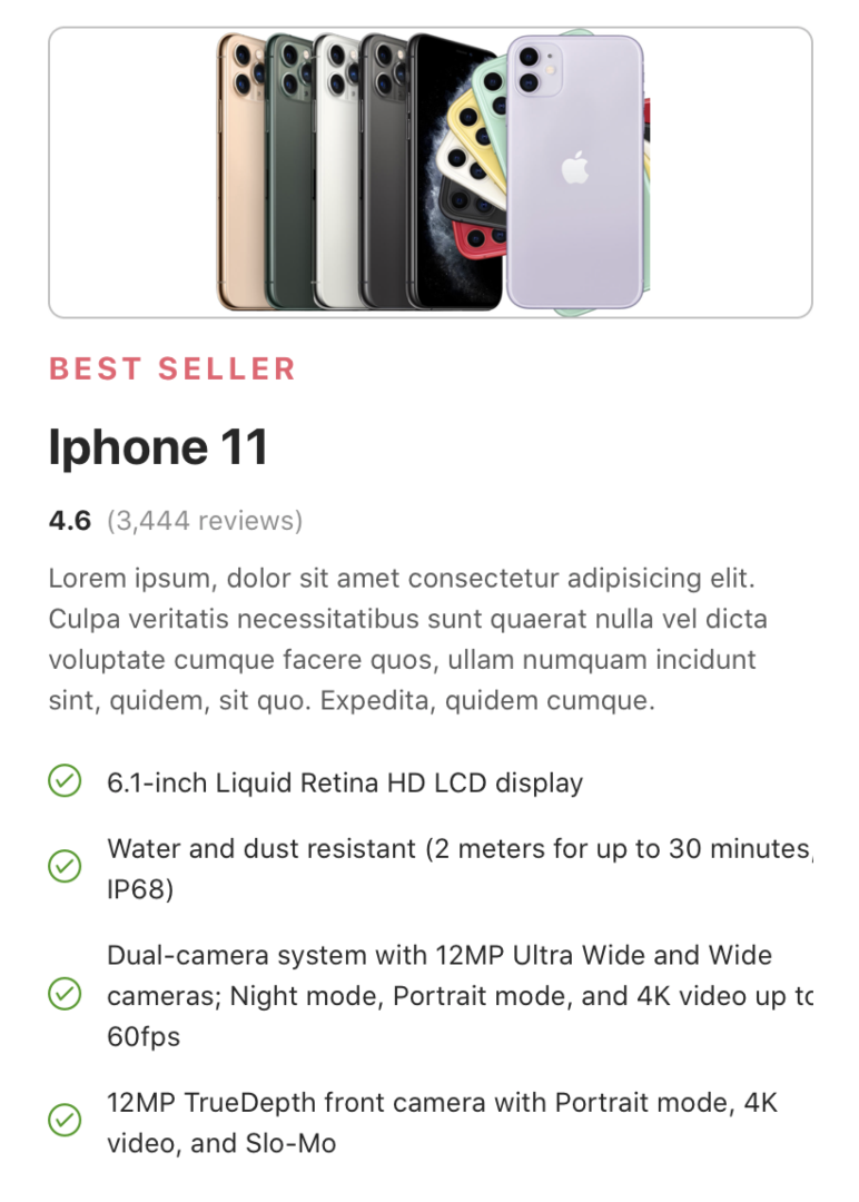
"6.1-inch Liquid Retina HD LCD display",
"Water and dust resistant (2 meters for up to 30 minutes, IP68)",
"Dual-camera system with 12MP Ultra Wide and Wide cameras; Night mode, Portrait mode, and 4K video up to 60fps",
"12MP TrueDepth front camera with Portrait mode, 4K video, and Slo-Mo",
];
return (
<ThemeProvider>
<SafeAreaView style={{ flex: 1 }}>
<Div mx="xl" mt="md">
<Image
h={140}
resizeMode="contain"
borderWidth={1}
borderColor="gray300"
rounded="lg"
w="100%"
source={{
uri:
"https://images.idgesg.net/images/article/2019/09/iphone-11-and-pros-100810657-large.jpg",
}}
/>
<Text
fontSize="lg"
fontWeight="bold"
textTransform="uppercase"
color="red400"
letterSpacing={2}
mt="lg"
>
Best Seller
</Text>
<Text fontWeight="bold" fontSize="4xl" mt="md">
Iphone 11
</Text>
<Div mt="md" row>
<Text fontWeight="bold" mr="sm">
4.6
</Text>
<Text color="gray500">(3,444 reviews)</Text>
</Div>
<Text mt="md" color="gray700">
Lorem ipsum, dolor sit amet consectetur adipisicing elit. Culpa
veritatis necessitatibus sunt quaerat nulla vel dicta voluptate
cumque facere quos, ullam numquam incidunt sint, quidem, sit quo.
Expedita, quidem cumque.
</Text>
<Div mt="md">
<FlatList
data={features}
renderItem={({ item }) => (
<Div row mt="lg">
<Icon name="checkcircleo" color="green700" />
<Text ml="lg">{item}</Text>
</Div>
)}
/>
</Div>
</Div>
</SafeAreaView>
</ThemeProvider>
);
};
export default App;Props
Accepts all props supported by Text of react-native.
| Property | Description | Type | Default |
|---|---|---|---|
| m | margin | string | number |
- |
| mt | margin top | string | number |
- |
| mr | margin right | string | number |
- |
| mb | margin bottom | string | number |
- |
| ml | margin margin left | string | number |
- |
| mx | margin horizonal | string | number |
- |
| my | margin vertical | string | number |
- |
| p | padding | string | number |
- |
| pt | padding top | string | number |
- |
| pr | padding right | string | number |
- |
| pb | padding bottom | string | number |
- |
| pl | padding margin left | string | number |
- |
| px | padding horizonal | string | number |
- |
| py | padding vertical | string | number |
- |
| h | height | number | string |
- |
| w | width | number | string |
- |
| color | color of text. | string |
gray900 |
| bg | background color | string |
- |
| minH | mininmum height | number |
- |
| minW | minimum width | string |
- |
| flex | flex property for container | number |
- |
| fontSize | font size for text | string |
- |
| textDecorLine | text decoration line style | "none" | "underline" | "line-through" | "underline line-through" |
- |
| textDecorStyle | text decoration style | "solid" | "double" | "dotted" | "dashed" |
- |
| textDecorColor | color for text decoration | string |
transparent |
| fontWeight | font weight for text | string |
- |
| lineHeight | line height for text | string |
- |
| textAlign | text alignment property | "auto" | "left" | "right" | "center" | "justify" |
left |
| textTransform | text transform property | "none" | "uppercase" | "lowercase" | "capitalize" |
- |
| letterSpacing | letter spacing | number |
- |
| rounded | border radius | string | number |
none |
| roundedTop | border radius top | string | number |
none |
| roundedBottom | border radius bottom | string | number |
none |
| roundedLeft | border radius left | string | number |
none |
| roundedRight | border radius right | string | number |
none |
| borderColor | color for border | string |
- |
| borderTopColor | color for border top | string |
- |
| borderRightColor | color for border right | string |
- |
| borderLeftColor | color for border left | string |
- |
| borderBottomColor | color for border bottom | string |
- |
| borderWidth | width for border | number |
- |
| borderTopWidth | width for border top | number |
- |
| borderRightWidth | width for border right | number |
- |
| borderLeftWidth | width for border left | number |
- |
| borderBottomWidth | width for border bottom | number |
- |
| opacity | opacity | number |
- |