Modal
Wrapper around <Modal /> of react-native-modal. It accepts all the props react-native-modal offers.
import React, { useState } from "react";
import { SafeAreaView, StatusBar, FlatList } from "react-native";
import { Div, Button, Icon, Modal, ThemeProvider } from "react-native-magnus";
const App = () => {
const [visible, setVisible] = useState(false);
return (
<ThemeProvider>
<StatusBar barStyle="dark-content" />
<SafeAreaView style={{ flex: 1 }}>
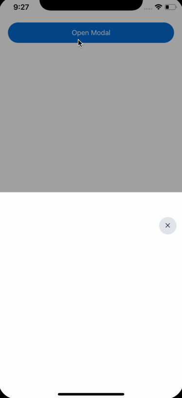
<Button block m={10} onPress={() => setVisible(true)}>
Open Modal
</Button>
<Modal isVisible={visible}>
<Button
bg="gray400"
h={35}
w={35}
position="absolute"
top={50}
right={15}
rounded="circle"
onPress={() => {
setVisible(false);
}}
>
<Icon color="black900" name="close" />
</Button>
</Modal>
</SafeAreaView>
</ThemeProvider>
);
};
export default App;Props
| Property | Description | Type | Default |
|---|---|---|---|
| h | height of modal | number |
100% |
| bg | background of modal | string |
white |
Apart from these props, The <Modal /> also accepts all props available in react-native-modal.