Input
Wrapper around <TextInput /> of react-native
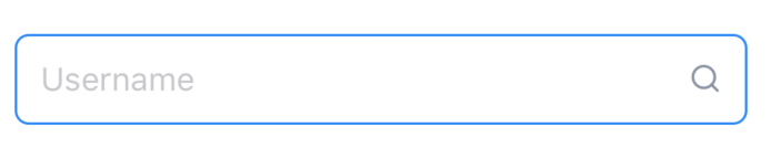
import { Input, Icon } from "react-native-magnus";

<Input
  placeholder="Username"
  p={10}
  focusBorderColor="blue700"
  suffix={<Icon name="search" color="gray900" fontFamily="Feather" />}
/>;
Examples
Password Entry
As <Input> accepts every prop of <TextInput>, We can set input for password with secureTextEntry prop.
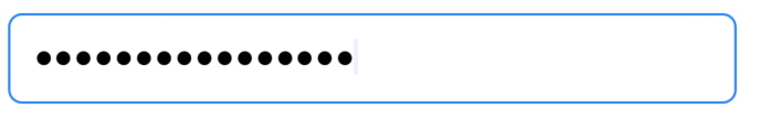
<Input
  placeholder="Password"
  mt="md"
  p={10}
  secureTextEntry
  focusBorderColor="blue700"
/>
Props
| Property | Description | Type | Default |
|---|---|---|---|
| m | margin | string | number |
- |
| mt | margin top | string | number |
- |
| mr | margin right | string | number |
- |
| mb | margin bottom | string | number |
- |
| ml | margin margin left | string | number |
- |
| mx | margin horizonal | string | number |
- |
| my | margin vertical | string | number |
- |
| p | padding | string | number |
- |
| pt | padding top | string | number |
- |
| pr | padding right | string | number |
- |
| pb | padding bottom | string | number |
- |
| pl | padding margin left | string | number |
- |
| px | padding horizonal | string | number |
- |
| py | padding vertical | string | number |
- |
| h | height | number |
- |
| w | width | number |
- |
| bg | background color | string |
- |
| minH | mininmum height | number |
- |
| minW | minimum width | string |
- |
| rounded | border radius | string | number |
none |
| roundedTop | border radius top | string | number |
none |
| roundedBottom | border radius bottom | string | number |
none |
| roundedLeft | border radius left | string | number |
none |
| roundedRight | border radius right | string | number |
none |
| borderColor | color for border | string |
- |
| borderTopColor | color for border top | string |
- |
| borderRightColor | color for border right | string |
- |
| borderLeftColor | color for border left | string |
- |
| borderBottomColor | color for border bottom | string |
- |
| borderWidth | width for border | number |
- |
| borderTopWidth | width for border top | number |
- |
| borderRightWidth | width for border right | number |
- |
| borderLeftWidth | width for border left | number |
- |
| borderBottomWidth | width for border bottom | number |
- |
| shadow | describe the depth of shadow to be used | number |
- |
| shadowColor | color for shadow | string |
- |
| color | color for input text | string |
- |
| loading | loading state for input. Shows ActivityIndicator when true | boolean |
false |
| loaderSize | size for loader component | string | number |
md |
| loaderColor | color for loader component | string |
gray300 |
| focusBorderColor | border color when input is focussed | string |
- |
| suffix | renders a components at the end of input container | React.ReactNode |
- |
| prefix | renders a components at the beginning of input container | React.ReactNode |
- |